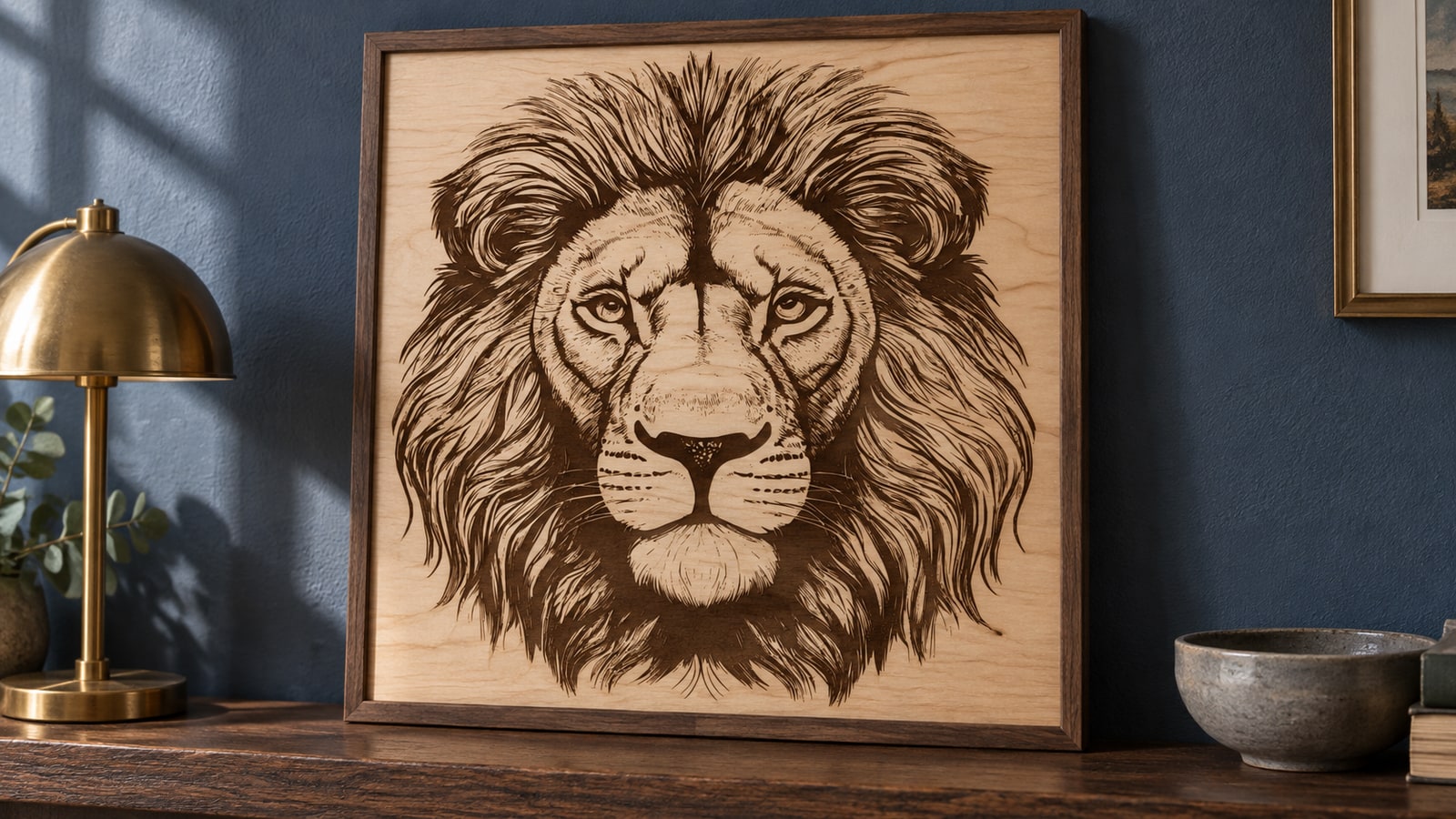
You have a birch blank, a name, and a phone full of saved nursery photos. Then you go looking for the actual cut files, and the safari category hands you a snarling lion, a rhino study with every skin fold drawn in, and an elephant portrait with more interior linework than a name sign has room for.
Those are good designs. They are just drawn for a different wall. A nursery piece is small, it usually carries a child's name, and it has to look gentle from a cot rather than impressive from a doorway. That changes which files you buy and what you do with them.
Tip
The short version: nursery pieces are small and personalised, so pick designs built from rounded, chunky shapes, and pick a composition that leaves an empty zone for the name. Sloths, baby elephants and giraffes simplify well. Whiskers, thin legs and fine mane hatching do not.
Friendly is a drawing decision, not an animal
There is nothing about a lion that makes it unsuitable for a two year old. Plenty of nurseries have one on the wall. What separates friendly from fierce is a short list of drawing choices, and once you can name them you can pick the right file out of a thumbnail grid at a glance.
Eye size and placement. A large eye set low on the head reads as young. Small eyes set high read as adult, and a narrowed eye reads as a threat no matter how cute the rest of the animal is.
Head to body ratio. Babies of every species have oversized heads and short limbs. A design that exaggerates that reads as a baby animal even when nothing else about it changes.
The mouth. Closed, or a simple upward curve. Visible teeth flip an animal from friendly to wild instantly, which is exactly why the same lion pack serves both a nursery and a man cave depending on which design you open.
Line ends. Rounded terminals and softened corners read as soft even when the finished piece is cut from hard maple, and sharp points read as spiky. It is a real property of the paths in the file, and the quickest tell when you are comparing two designs of the same animal.
The pose. Standing square or sitting beats lunging. A sitting animal also happens to cut better, because the limbs are tucked against the body instead of sticking out as thin projections that can snap.
The giraffe, and the height chart it was born for
Giraffes are the one safari animal whose natural proportions are already a vertical composition, which is why they end up on so many growth charts. A simplified neck can form a continuous piece, but its narrowest width still needs checking. A solid backing or engraved treatment supports delicate anatomy.
Two parts are worth checking before you commit a board. The ossicones, those small horn nubs on the head, may become thin projections or detached regions in a cut file; check their connections at the intended size. And the tail ends in a tuft that is usually the thinnest thing in the whole design.
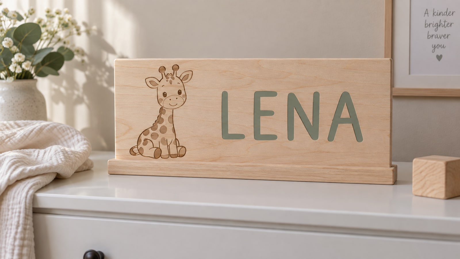
The spots are the interesting decision, and the three ways of handling them are not interchangeable. Engrave them and the design stays one solid piece. Cut them through and they become openings, so check the remaining neck and body strength. On a vinyl build they become a second colour layer over the body, which is the version that reads best in a nursery because the spots come out in a soft tan rather than as gaps.
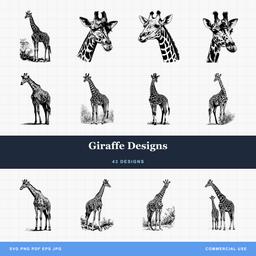 Giraffe Designs43 designs, commercial license included$3.99
A full height chart usually wants around four feet of usable scale, which is taller than most machine beds, so the common build is a giraffe panel at the top and a separate marked strip below it. That also keeps the animal on one clean board instead of spanning a joint.
Leave room for the name
This is the part most people work out on their second sign rather than their first. A nursery design and a name are competing for the same board, and the design has to lose that argument gracefully.
Four compositions come up again and again:
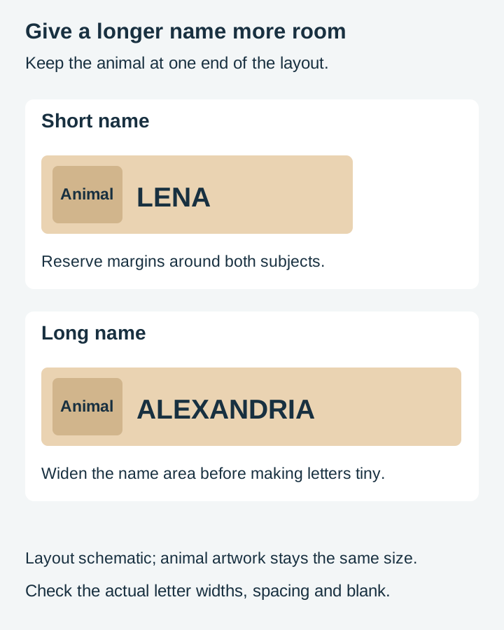
- Animal at one end, name filling the rest. The most flexible layout by a distance, because a long name just pushes the text zone wider without touching the animal.
- Two animals flanking the name. Symmetrical and lovely, but a ten letter name blows the balance apart, so this one suits short names only.
- Animal above or below the name. The name gets unlimited width and the sign gets taller. This is the layout for the Alexandrias and the Sebastians.
- Animal peeking over the top of the letters, or tucked inside one. The most charming and the least reusable, since it is built around a specific letter count and a specific letterform.
When you are choosing a file, check whether the animal is a separate object from any surrounding decoration. A normal group can be ungrouped, but a unioned shape or compound path needs a different edit. Separate animal objects let you move the illustration without damaging its internal holes, and it is worth doing before you spend twenty minutes nudging text around a fixed layout.
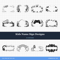
Ready made letters are worth a mention too. Cutting a name from a designed alphabet gives you a different look than typing it in a font, and it skips the text-to-path step altogether. The Kids Name Sign Designs pack covers that side, and our guide to personalizing designs for customers walks through adding text in Design Space, Silhouette Studio, Inkscape and LightBurn if you would rather set the name yourself.
What survives at nursery size
Nursery work is small work. A mobile shape is three to four inches. A shelf animal is five to eight. The animal on a name sign is rarely more than six, because the name has to be the loud part.
At those sizes, the casualties are predictable: whiskers, ankles and lower legs, tail tufts, individual toes and claws, eyelashes, fine mane hatching, and spot patterns made of tiny separate dots. All of them are thin, and thin is what fails first.
Every cut has width, so a leg drawn 1.5mm across loses a real fraction of itself to the cut on both sides. In vinyl, that same leg is the piece your weeding pick lifts by accident. In wood, it is the piece that snaps when you pop the part out of the sheet. The detail limits on small items post goes through the mechanics properly.
What you do about it matters more than knowing it. In order of preference: pick a simpler design from the same pack rather than shrinking a complex one, since a design drawn simple is not the same as a detailed design reduced. Thicken the thin parts. Merge the legs into a base so nothing stands alone. Or move the detail from cut to engrave, where nothing has to hold itself together.
This is why sloths do so well in kids' rooms. A sloth is drawn almost entirely from arcs: round head, round body, curved hook arms, and nothing that sticks out except the claws, which are easily thickened. Koalas and pandas share the same build. Baby elephants have it too, since the body is one solid mass and the ears are wide rather than fine.
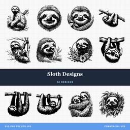 Sloth Designs30 designs, commercial license included$3.99
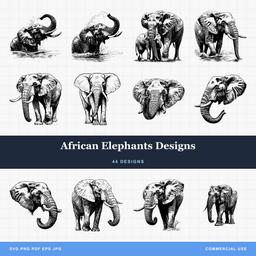 African Elephants Designs44 designs, commercial license included$3.99
Matching the project to the piece
The sizes below are a design-side starting point drawn from how we build the files, not something measured on a machine, so treat them as a place to begin and test on your own material.
| Project | Typical size | What to pick |
|---|---|---|
| Name sign | 18 to 30 in wide | Animal at one end, simplified, spots engraved not cut |
| Height chart | 36 to 48 in tall | Giraffe in profile, panel plus a separate marked strip |
| Mobile shapes | 3 to 4 in each | Chunky silhouettes only, no interior cuts, balanced weights |
| Shelf animals | 5 to 8 in | Standing or sitting poses, painted MDF or pale hardwood |
| Wall letters | 6 to 10 in tall | One small animal per letter, or one animal on the initial |
| Wall decals | 8 to 24 in | Flat colour shapes, removable adhesive vinyl, no fine linework |
| Onesies and shirts | 3 to 5 in | Single colour HTV, or two layers at most |
Mobiles deserve one extra note. Both faces of a hanging shape are visible. A second-side engraving needs registration to the physical flip; do not mirror readable text automatically. And the standard warning printed on commercial crib mobiles is to mount it out of reach and remove it by five months or once the baby can push up on hands and knees, whichever comes first. Follow the American Academy of Pediatrics nursery guidance and the product’s instructions. A decorative SVG does not establish a finished mobile’s suitability for a crib.
Wood, paint and the current nursery palette
Birch and maple are the usual choices because they are pale and take paint well. For a surface-marking treatment, birch can give a shallow dark mark, which suits a simple animal outline and looks weak on anything trying to show texture. Painted MDF is the cheaper route and the more colourful one, and for shelf animals it is often the better look.
Current nursery decor leans muted rather than primary. Sage, clay, oatmeal and dusty blue turn up far more than bright red and yellow, which is worth knowing if you are cutting a set to sell rather than one piece for a room you have seen. Two or three colours across a matched set beats seven.
On walls, use removable adhesive vinyl rather than permanent. Nursery decals get changed when the child turns four, and test on the actual cured paint; removable vinyl does not guarantee damage-free removal.
If you want the same animals at adult scale
Everything above assumes small and gentle. The same safari animals go the other way too, and the design choices invert almost completely: bold silhouettes with real visual mass, cut clean through a panel, sized to hold a wall on their own. We covered that lane separately in elephant, rhino and zebra designs for statement wall art. A mother and calf elephant composition is one of the few motifs that genuinely works in both rooms, at very different sizes.
Start with one animal and one name
Every pack in the Safari and Exotic collection is $3.99 and ships as SVG, PNG, JPG, PDF and EPS, so you have the vector for cutting and the raster for printing. The commercial license is included, with no cap on how many physical pieces you sell, and print-on-demand is allowed if you want safari onesies alongside the wooden signs.
Start with a giraffe on a name sign. It forgives a long name, it simplifies without losing what makes it a giraffe, and it is the piece most likely to get you asked for a second one.
Designs for this project
Frequently Asked Questions
Which safari animals work best at nursery sizes?
The ones built from rounded, chunky shapes. Sloths, baby elephants, koalas and pandas are drawn almost entirely from arcs, so they hold their charm when a design is simplified down to a five inch shelf piece or a three inch mobile shape. Animals whose character lives in fine parts, such as lion manes, whiskers and long thin legs, lose the thing that made them appealing as soon as you shrink them.
How big should a nursery name sign be?
Most sit somewhere between 18 and 30 inches wide, which is wide enough to read across a room and narrow enough to display securely on a wall or above a dresser away from the sleep space. The name decides the rest. A six letter name at 24 inches gives roughly three inches per letter once you allow margins, and a ten letter name leaves less space per letter, so pick a layout you can stretch sideways rather than one built around a fixed number of letters.
Can I sell name signs made from these designs?
Yes. A commercial license is included with every purchase, with no unit cap on physical products, and print-on-demand is allowed, which covers safari animal onesies and kids' shirts through services like Printful. The one thing you cannot do is pass on the design file itself.