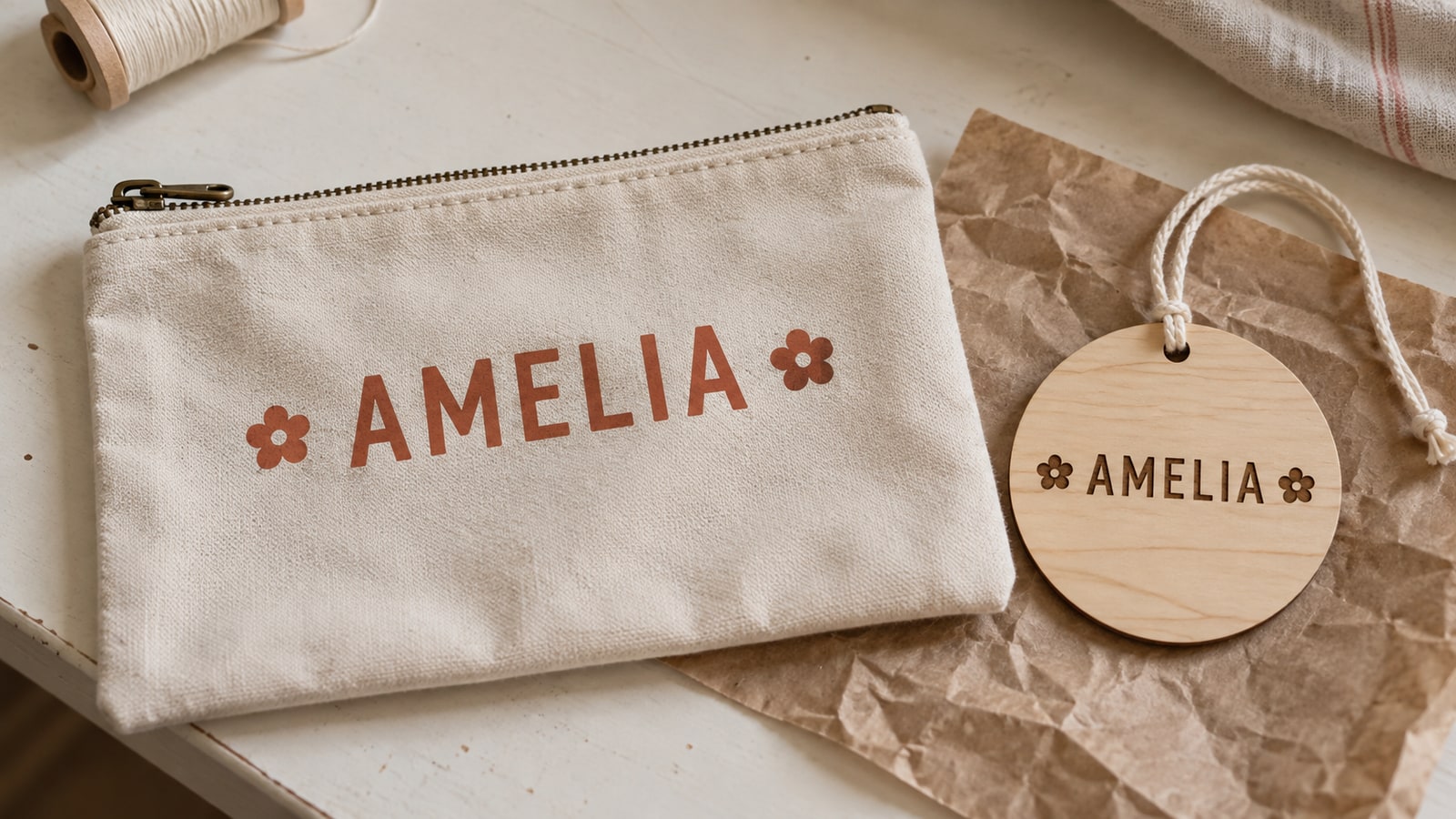
A customer messages at nine in the evening asking whether you can put their daughter's name on the design in your photo. You say yes, because of course you say yes, and then you spend the next forty minutes fighting a font that keeps overlapping the artwork and a text object your machine refuses to treat as a cut line.
Personalization is the highest-value thing you can offer and the fastest way to lose an evening. The difference between the two is entirely in how you handle the file, and most of the traps are avoidable once, permanently, instead of being rediscovered on every order.
Tip
Short answer: add your text, position it, then convert it to paths before you save. Live text depends on a font being installed on whatever machine opens the file next, and paths do not. Everything else about personalization is easier than that one step.
Why a name changes what an item is worth
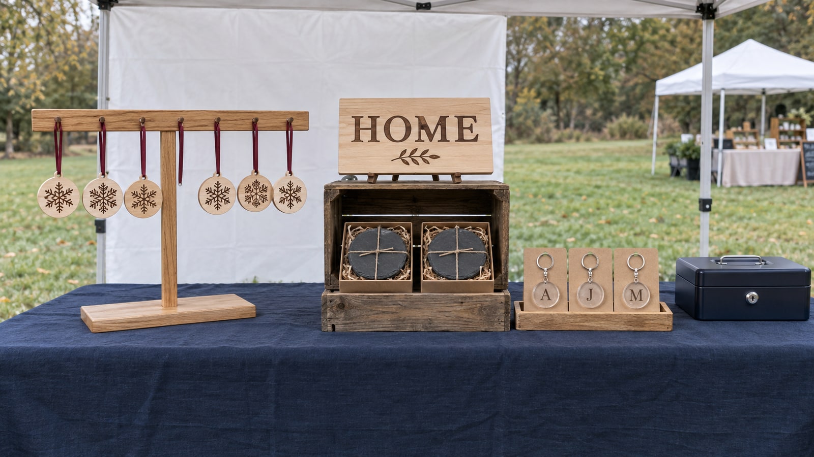
A blank ornament competes with every other blank ornament, including the mass-produced ones. An ornament with a child's name on it competes with nothing, because nobody else is selling that exact object.
That is the whole mechanism. Personalization removes your product from price comparison, and it moves the purchase from decorative to sentimental, which is a different buying decision entirely. Buyers who would hesitate over a nine dollar sign will not blink at a personalized one, because they are no longer buying a sign.
It also has practical effects on the business. Custom pieces are made after the sale, so you carry less stock, and a customer who orders a personalized gift for one person tends to come back at the next birthday, wedding, or new baby with another name in mind.
The trade is that you own the details now. A misspelled name is not a return, it is a remake, and the material and hours are yours.
The four kinds of personalization, in order of difficulty
Names and short text are the bulk of it. A family name on a welcome sign, a pet name on a memorial ornament, a single word on a keychain. This is where the file craft matters most, and where the rest of this guide spends its time.
Dates are easier than names because they are short and numeric, but they carry the highest cost of error. An anniversary is a fact, and getting it wrong is memorable in a way you do not want.
Monograms are their own tradition with rules attached. A three-letter married monogram conventionally puts the shared surname initial in the centre at a larger size, with first names either side. Getting that order wrong on a wedding gift is a real complaint, so ask the customer to confirm rather than guessing.
Colour and size options are the cheapest personalization to offer because they change nothing about the file. Offer three vinyl colours or two sign sizes and your listing gets a customization dropdown without any extra design work at all.
Split monograms, and why they are their own product
A split monogram is a decorative frame with a deliberate gap through the middle where the letter goes. Done well, the letter looks like it grew out of the ornament. Done badly, it looks like a letter dropped into a hole.
The structure is what makes them work. The frame is drawn so its two halves meet the letter's outer edges rather than crowding them, and the gap is sized for a wide letter, not an average one. A W and an I are not the same problem, and a frame built only around an average letter will look starved on one and cramped on the other.
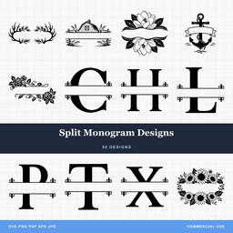 Split Monogram Designs50 designs, commercial license included$3.99
When you set the letter, match its visual weight to the frame rather than its point size. A thin script letter inside a heavy frame reads as an accident. Overlap matters too: leave a hair of overlap where the letter meets the frame so a single cut line joins them, rather than a gap that leaves a floating letter with nothing holding it in place.
For a freestanding wood or paper cutout, the letter needs a physical connection to the frame. Vinyl can use separate pieces held in position by transfer tape and then adhered to the surface. Weld overlapping outlines when they must form one connected cut shape; welding does not bridge an empty gap.
Adding text in Cricut Design Space
- Upload the SVG and place it on the canvas.
- Click Text in the left panel and type the name.
- Choose a font that suits the design. System fonts you have installed appear alongside Cricut's own.
- Size and position the text where it belongs on the design.
- Adjust Letter Space if the letters look loose or collide. Script fonts almost always need tightening to connect properly.
- Select both and use Attach to preserve their cutting positions, or Weld to merge overlapping shapes. Attach does not turn separate outlines into a connected physical piece.
Attach and Weld do different things and the difference matters. Attach holds the arrangement so pieces cut in place on the mat. Weld permanently fuses overlapping shapes into one outline, which is what you want for connected script but is irreversible once saved. Our Cricut Design Space guide covers the wider workflow.
Adding text in Silhouette Studio
- Open the SVG design.
- Select the Text tool from the left toolbar, click on the workspace, and type.
- Pick a font and set the size in the Text Style panel.
- Use the character spacing and line spacing controls to tune the fit.
- Position the text relative to the design.
- Right-click the text and choose Convert to Path so the letters become permanent outlines.
- For connected script, select the letters and use Weld so overlapping strokes cut as one shape.
Converting to path in Silhouette also unlocks node editing, which is how you fix a letter pair that collides awkwardly. There is more on the software in our Silhouette Studio guide.
Adding text in Inkscape, which is free and the most precise
- Open the SVG in Inkscape.
- Press T for the Text tool and click where the text should start.
- Type, then set the font and size from the toolbar.
- Use Text and Font for tracking, and the kerning controls for individual letter pairs.
- Position with the Selection tool, using Object > Align and Distribute to centre the text against the artwork properly rather than by eye.
- The step that matters: select the text and choose Path > Object to Path. This converts letters into permanent outlines.
- If letters overlap and must cut as one piece, select them and use Path > Union.
- Save as Plain SVG.
Object to Path is not optional if the file is going anywhere other than your own screen. Until you run it, the file stores your text as characters plus a font name, and any machine without that font installed substitutes something else. Our Inkscape editing guide has the full walkthrough.
Adding text in LightBurn
- Import the SVG design.
- Click the Text tool and click on the workspace.
- Type the text and choose a font.
- Position and size it against the artwork.
- Assign the text to a layer. Same layer as the design if it engraves identically; a separate layer if you want different speed or power for it.
- For a repeating job, use Variable Text so one file handles a whole run of different names.
Variable text is the feature that turns personalization from a per-order chore into a production step. Set the text object to pull from a list or a counter, and the same file runs a batch of different names without you touching the layout. That pairs naturally with the approach in our guide to batch producing crafts. For the import side, see our LightBurn SVG tutorial.
Choosing a font that survives the process
Fonts are chosen on screen and paid for at the machine. The visual style is the easy half; the important half is whether the letterforms hold up in your material at your size.
| Font style | Reads as | Watch out for |
|---|---|---|
| Script | Elegant, personal, wedding-appropriate | Thin connecting strokes that tear in vinyl and close up when engraved small |
| Sans-serif | Clean, modern, legible at any size | Can look generic on sentimental pieces |
| Serif | Traditional, formal, good for names and dates | Fine serifs are the first thing to break on small cut letters |
| Handwritten | Casual, warm, farmhouse | Uneven baselines make alignment against artwork fiddly |
| Slab and display | Bold, high contrast, strong on signs | Wide letterforms eat horizontal space fast on long names |
The rule that catches everyone out is stroke width against process. A hairline script that cuts beautifully at eight inches on a sign will not survive at two inches on an ornament, because the thin part of each stroke drops below what the material can hold. Vinyl tears there during weeding. Wood chars into a blur. Acrylic snaps.
Test once per font and material combination, at the smallest size you sell, and keep a note. That short list of fonts you know behave is worth more than a library of a thousand you have never cut.
Then check the licensing. A great many free fonts are licensed for personal use only, and using one on items you sell is the same category of problem as using a personal-use design. Fonts published through Google Fonts under open licenses are safe for commercial work, and any font you buy comes with its own terms attached. Read them once and keep the safe ones in a folder.
Ready-made letters, when text tools are the wrong tool
Not every personalized piece needs a font at all. Decorative alphabets are supplied as artwork rather than as type, which means the letterforms are already drawn as clean paths with the flourishes and the weights intentional rather than generated.
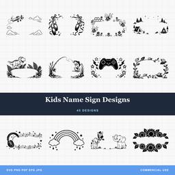 Kids Name Sign Designs45 designs, commercial license included$3.99
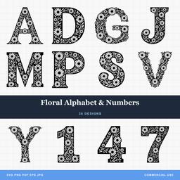 Floral Alphabet & Numbers36 designs, commercial license included$3.99
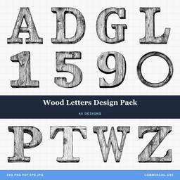 Wood Letters Design Pack40 designs, commercial license included$3.99
This route suits anything where the letters are the decoration. Standing wooden letters, floral initials on nursery signs, and layered name plaques all look better built from designed letterforms than from a font stretched to fit. It also skips the conversion step entirely, since the letters arrive as paths already.
For quick one-off initials, Craftgineer's free monogram generator will produce a cutting-ready SVG in a few seconds without opening design software at all.
The licensing question you will be asked
Customers occasionally ask whether a design is "really yours" if you personalize it. The honest answer is that you licensed the artwork and made the object, which is exactly how the craft has always worked.
The PrintCutCarve commercial license comes with every purchase, at $3.99 a pack or through the Platinum Club at $59.99 a year, and it explicitly allows you to modify, resize, and customize the designs and to sell unlimited physical products you make from them. Personalization is a normal use, not an edge case.
The boundary is the file. You cannot sell or share the digital file, and adding a name to it does not change that. Print-on-demand platforms are permitted too, so a personalized design can be fulfilled by a third party if that suits your workflow. Full detail is in our commercial license guide.
Fonts have their own separate licenses, and a font's terms are not covered by ours. That is the piece most sellers forget.
Running personalization as a business, not a favour
Build a template per product. The design placed at final size, the text element sitting in its final position with the right font already selected, everything else decided. Opening a template and typing a name should take under a minute. Rebuilding the layout every time is the difference between a profitable custom order and an unpaid evening.
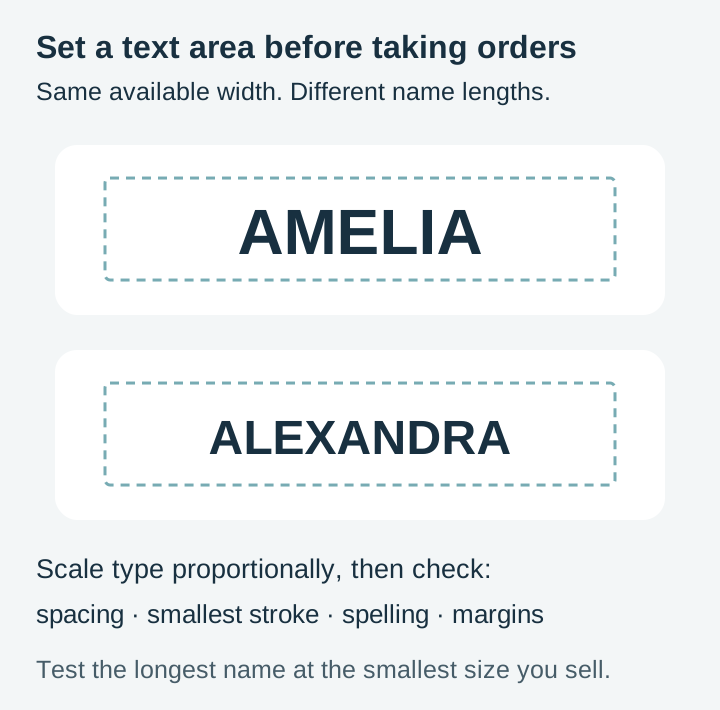
Publish a character limit. "Up to 15 characters" in the listing stops a customer sending a paragraph for a sign that fits a first name. Derive the number by actually cutting the longest name you would accept and checking that the thinnest stroke survived.
Send a proof for anything expensive. A quick screenshot of their text on the design, sent before you cut, catches spelling errors while they are still free. For cutting boards, large signs, and anything with a date on it, proof every time. Ask the customer to confirm the spelling in writing rather than just approving the picture.
Handle the awkward characters up front. Apostrophes, accents, hyphenated surnames, and names in all capitals all change the layout. Ask how they want it written rather than deciding for them, and check that your font actually contains the accented characters before you promise anything.
State a processing time and protect it. Personalized items cannot ship from stock, so "3 to 5 business days for personalized orders" belongs in the listing. Then batch the custom work into set days rather than dropping everything each time an order arrives.
Charge for it properly. Personalization costs you setup time, proofing time, and the risk that a remake is your problem. Price it as a per-item upcharge rather than absorbing it, and read our guide to pricing handmade crafts for where that sits in a healthy margin.
Start with designs built to take a name
The designs that personalize best are the ones with somewhere for the text to live: banners under an animal silhouette, frames with an empty centre, wreaths and borders with an open middle, signs with a clear lower band.
Browse the quote and sign designs for frames and name-ready layouts, or the full catalog for artwork to pair with a customer's name. Every pack is $3.99 with SVG, PNG, JPG, PDF, and EPS included, and the commercial license comes with it.
Then, when the custom orders start arriving faster than your evenings can absorb them, our Etsy selling guide covers how to set up listings that ask for the right information before the order lands in your queue.
Designs for this project
Split Monogram Designs50 designs, commercial license included$3.99Kids Name Sign Designs45 designs, commercial license included$3.99Floral Alphabet & Numbers36 designs, commercial license included$3.99Wood Letters Design Pack40 designs, commercial license included$3.99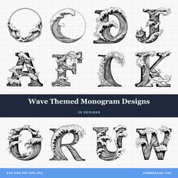 Wave Themed Monogram Designs29 designs, commercial license included$3.99
Frequently Asked Questions
Does the commercial license cover adding a customer's name to a design?
Yes. The PrintCutCarve license lets you modify, resize, and customize the designs, and sell unlimited physical products you make from them. Adding a name, date, or monogram is a normal use. What you cannot do is resell the digital file itself, personalized or not.
Why does my text look right on screen but cut wrong?
Almost always because the text is still live text rather than paths. Live text depends on the font being installed and on the software's own rendering, so it shifts or substitutes when the file moves. Converting text to paths before saving locks the letter shapes into the file permanently.
What is a split monogram?
A decorative frame with a gap in the middle where a single letter or a family name sits, so the name reads as part of the ornament rather than as a label stuck on top. The letter is added by you at personalization time, which is why split monogram frames are sold as reusable designs.
How many characters should I allow on a personalized item?
Set the limit from the piece, not from a rule. Cut the design with the longest name you are willing to accept, check that the thinnest stroke still survives at that size, and publish that count in your listing. Fifteen characters is a common ceiling for a single-line name sign.