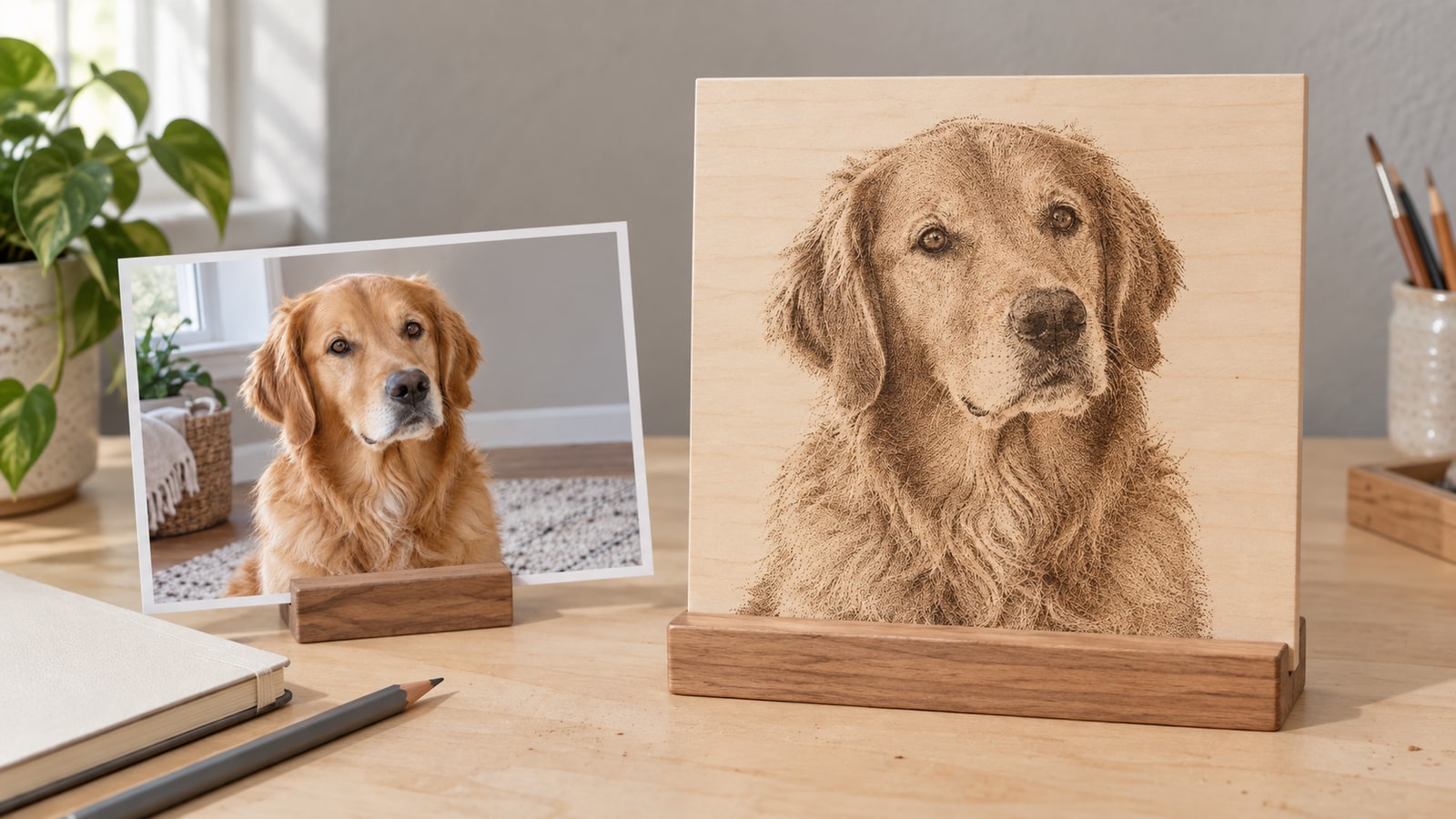
You picked the photo carefully. It looks wonderful on your screen: the light on the face, the depth in the background, the whole reason you wanted to engrave it in the first place. Then it comes off the machine as a dark grey-brown smudge where you can just about tell there is a head, and you have burned a perfectly good piece of wood to find that out.
The reflex is to blame settings. Turn the power down, run it faster, try a different dither mode, burn another test. Those settings can matter as much as the file. Check both the image preparation and a controlled sample on the intended material.
Here is the uncomfortable part: a photograph and an engraving are not the same kind of image, and treating one as the other is what produces mud. Getting this right is file work, which is the part we actually do all day. So this is a guide to the preparation, not to the machine.
Tip
Start with a clear subject and test the tonal response. Dithering represents shading with on/off dots. Lifting crowded shadows may help, but the right adjustment depends on the photo, material and settings. Keep the original and compare prepared versions at the intended output size.
First, make sure you are reading the right guide
Two completely different jobs both get called "engraving a photo", and people burn a lot of material by attempting one while following instructions for the other.
Raster engraving hands the machine the photo itself. The laser sweeps back and forth like an inkjet printer, firing or not firing at each position, and builds the picture out of thousands of individual marks. The result is photographic. This post is about that.
Vector tracing throws the photograph away and replaces it with outlines: a stylized, poster-like drawing of the subject made of paths. The result is graphic rather than photographic, and it is what you need if the design must also be cut, scored, or carved along a line. If that is your job, our guide to converting photos to SVG for cutting and engraving covers it properly and you can stop reading here.
Use raster engraving to retain photographic tones. Use vector paths when you need the machine to follow defined outlines; both can form part of the same project.
 Rainbow Bridge Pet Memorial Designs45 designs, commercial license included$3.99
Why the photo looks great and engraves terribly
Your monitor is a light source. It shows you a deep black and a brilliant white in the same frame, and your eye reads everything in between as smooth continuous shading. A photograph is built to exploit that. It stores hundreds of distinct tones and trusts the screen to display them.
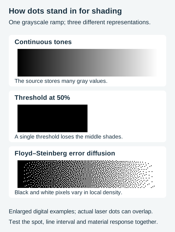
A dithered laser mark has none of that. At any given position on the material, the laser either fired or it did not. There is no half a burn. Wood does not have a tone dial.
There is one exception worth knowing before you go further. LightBurn's documentation describes a Grayscale image mode that varies laser power rather than switching it on and off, and it notes the result differs by machine type. That mode has its uses, but the dithered route is what most photo work on wood uses and it is what the rest of this guide prepares for.
So the machine fakes the greys, and it fakes them the same way a newspaper photo does: by varying how many dots land in a given area. Dense dots read as dark, sparse dots read as light, and your eye blurs them into shading from normal viewing distance. That process is dithering, and everything about preparing a photo comes down to giving it a file that dithers well.
Three things go wrong when you feed it a straight photograph.
The shadows fill in. A photo's darkest quarter of tones sits close enough to black that the dithering places dots nearly everywhere. Once the dots start touching, they stop reading as shading and become one solid burned area. That solid area is the smudge. Every bit of detail that lived in the shadows is now gone.
The material has its own range. Wood only goes so dark before it stops getting darker and starts getting deeper. Once you have hit the darkest scorch a board will give, extra power buys you nothing except a wider mark and lost detail. The usable tonal range of the finished piece is narrower than the tonal range of your photo, and the file has to be squeezed to fit it.
Grain competes with the picture. Wood is not a blank sheet. Its own light and dark bands sit underneath the engraving and eat contrast, especially in a portrait's midtones. This is why plywood, basswood, and painted or coated surfaces get recommended for photo work so often, and it is worth reading our notes on choosing materials for laser engraving before you commit a nice board.
File preparation helps, but dot size and overlap also depend on power, speed, focus, line interval and the material. Test those alongside the image.
How dithering actually decides your dots
Laser software offers a menu of image modes, and the names are not obvious. The table below is drawn from LightBurn's own Image Mode documentation, not from anything we measured, and other laser software uses the same algorithms under slightly different names.
| Mode | What LightBurn's docs say it is for |
|---|---|
| Threshold | A simple on/off switch based on whether a spot is dark or bright. Meant for images already reduced to black and white, not for grayscale |
| Ordered | Dots on a regular grid. Works well for solid fill areas, and the pattern is visible |
| Dither (error diffusion) | "The best choice for smoothly shaded images, like photos." Subtle shading with no obvious patterning |
| Stucki | Similar to Dither, faster than Jarvis, described as struggling in the midtones |
| Jarvis | "Generally the best choice for smooth-shaded or photo images." Slower than Stucki, better with midtones |
| Atkinson | Preserves detail better, but struggles to show detail in very light and very dark areas |
| Newsprint / Halftone | Deliberately patterned, publication-style dots. A look, not a fidelity mode |
| Grayscale | Varies the power output rather than dithering, so shading comes from mark intensity |
Two practical things fall out of that list.
The error diffusion modes (Dither, Stucki, Jarvis, Atkinson) are the photo modes, and they differ mostly in where they give up. Atkinson's weakness at the extremes and Stucki's weakness in the midtones are both worth knowing when you are staring at a result and wondering which part of the image failed.
Grayscale mode is a different animal. Instead of on/off dots it modulates power, which means the material and the machine have to respond smoothly to power changes for it to work. It is a genuine option on some setups and a mess on others, so treat it as something to try rather than something to default to.
The preparation pass
This is the actual work, and it lives entirely in an image editor. Keep an untouched copy and change one part of the preparation at a time, comparing the result at the final size.
1. Crop hard and pick the right photo
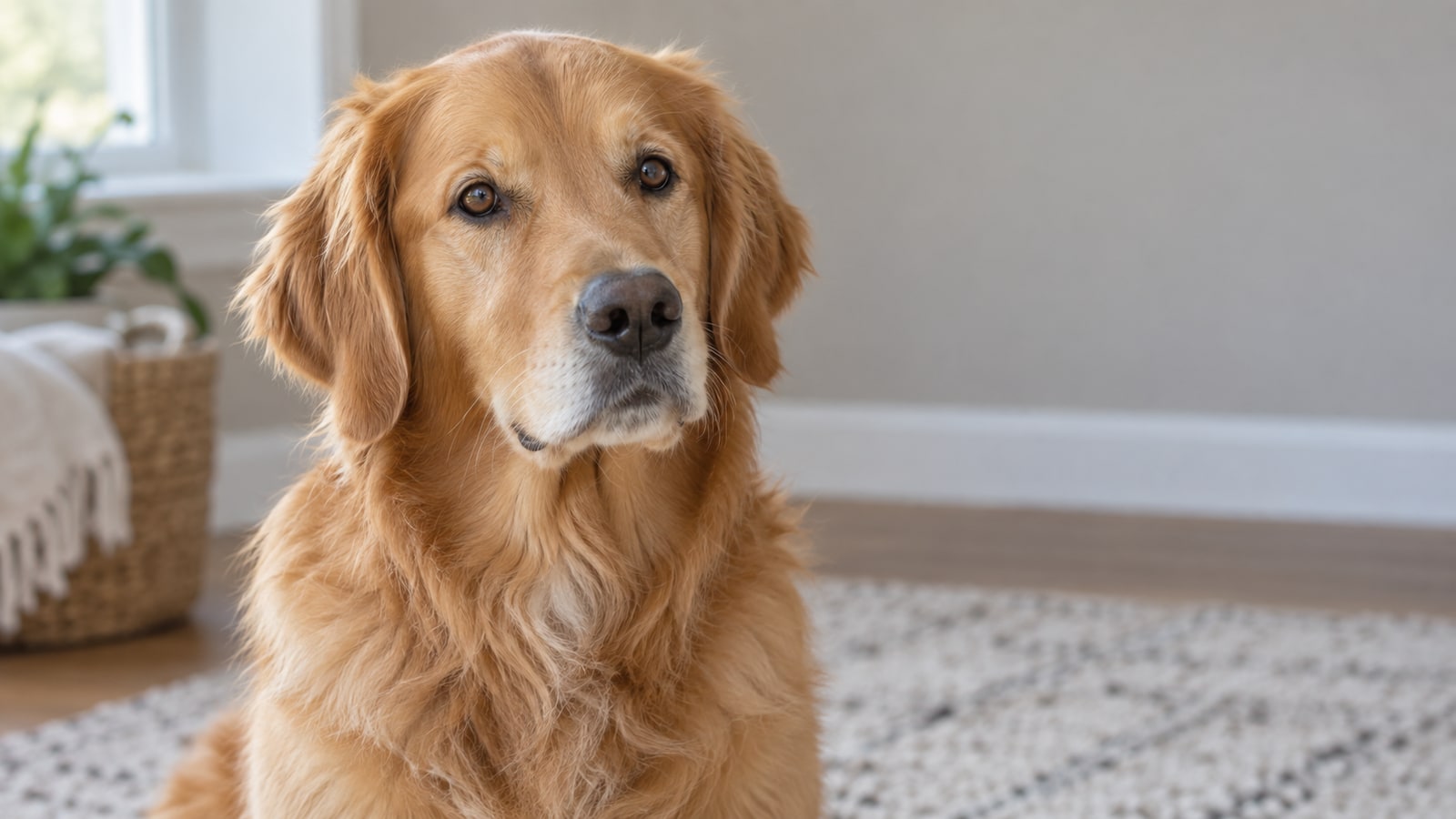
Engraving loses detail. Everything that is small in the frame will be smaller in dots, and below a certain size it stops resolving at all. Crop to give the important features enough space. A small face in a wide scene may lose detail on a small blank.
While you are there, be honest about the source. A sharp, well lit photo with clear subject separation is a better starting point. A dark dog against a dark sofa may have little recoverable separation, making another source photo more useful. Choosing a different photo is a legitimate and often faster fix.
2. Remove or simplify the background
A busy background does not fade politely into the wood. It dithers into a field of dots that competes with the subject and flattens the whole piece.
Either cut the background out entirely and let bare material be the surround, which usually looks better than people expect, or replace it with a smooth light tone. Either way, the subject should be the only thing carrying detail.
3. Convert to grayscale on purpose
Do not just desaturate and move on. Colour channels carry very different amounts of contrast, and picking the right one can hand you a much better starting image for free. A red subject on a green background may look low contrast in a plain desaturation and separate cleanly in a single channel. If your editor offers a black and white adjustment with per-colour sliders, spend a minute there.
Squint at the greyscale version. If the subject still reads clearly as a shape, you have something to work with.
4. Adjust the tones for the tested material
Look for useful detail in highlights, midtones and shadows.
If a test loses shadow detail, try lifting that range and separating the nearby midtones. Do not apply the same correction to every image.
- Open crowded shadows when needed. Raising dark output tones can reduce dense dot coverage; compare with the original to avoid losing shape.
- Protect useful highlights. In a normal dark-mark workflow, white can remain unmarked material. Preserve that when it is intentional; retain faint detail where it helps the subject.
- Adjust midtones while watching the preview. Gamma conventions vary between tools. Judge the visible result instead of assuming a larger number always brightens.
- Increase midtone contrast last. With the extremes tamed, adding local contrast in the middle is what puts the features back.
The prepared version may look lighter than the original, but a washed-out file is not the goal. Use a material test to choose the useful tonal range.
5. Sharpen, but not much
A little unsharp masking helps, because dithering softens edges and a small amount of pre-sharpening buys some of that back. Too much creates bright halos along every edge, and those halos engrave as visible white outlines around the subject. Small amount, then stop.
6. Set the pixel size to match the burn
This one gets skipped constantly. People hand the machine a 6000 pixel photo for a 4 inch coaster and assume more pixels means more detail.
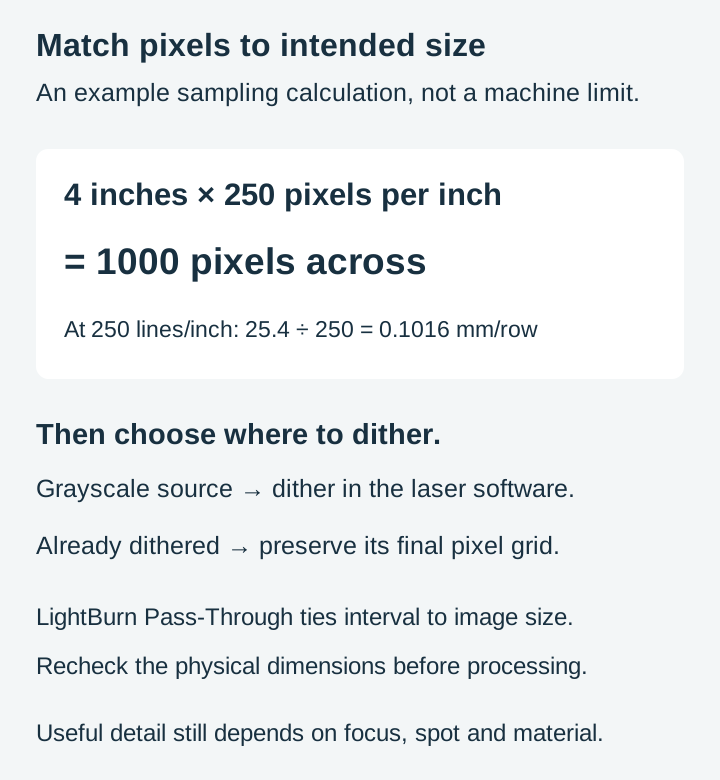
They do not. The machine places one row of dots per scan line, so line interval sets row spacing, while source pixels, laser spot, focus and material also limit useful detail. LightBurn's image engraving tutorial suggests testing line intervals between 120 and 300 DPI and then, once you find the value your machine likes, creating future images at that same DPI.
That gives you a simple sum. Multiply the physical width in inches by the DPI you settled on, and resize the image to that many pixels wide. A 4 inch piece at 250 DPI wants roughly 1000 pixels. Inspect the image at that output size. Resizing in an editor can make the sampling visible, but the screen preview cannot establish the material's final response.
7. Dither in the file, or leave it to the machine
You have two routes from here, and both are valid.
Send the prepared grayscale image and let the laser software dither it. Simple, and it keeps the dither tied to whatever line interval you set.
Or dither at the final pixel dimensions and use a workflow that preserves those pixels. In LightBurn, Pass-Through keeps a preprocessed image from being resampled and ties line interval to the image size. Check dimensions and preview; simply selecting Threshold does not guarantee that a pre-dithered pattern stays unchanged.
Slate turns all of this upside down
Slate is worth its own paragraph because it inverts the logic completely.
On wood, the laser darkens the surface, so dark parts of your photo become dark burned areas. On slate, the laser fractures the stone and leaves a pale grey to white mark on nearly black rock. The engraved area is the light area.
So a slate photo needs the negative. Adjust for the slate sample, then invert once in the editor or use the laser software’s Negative Image option: your subject's highlights become the areas that get engraved, and the shadows become untouched dark stone. Getting this backwards produces a piece that is technically fine and looks like a photographic negative, which is a memorable way to waste a coaster.
Slate’s dark surface can provide useful contrast, but texture, material variation and settings still affect the image. Our full guide to engraving on slate covers the material side, including which face to engrave and why slate quality varies so much between suppliers.
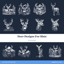 Deer Designs For Slate30 designs, commercial license included$3.99
Doing the file work without installing anything
Any decent image editor handles all of the above. GIMP, Krita, Photopea, or whatever you already own will do curves, grayscale conversion, and resizing.
The case for a browser tool is narrower and honest: you have one photo, you want it prepared now, and you do not want to install and learn a full editor to do it. That is also the case for a locked-down work laptop or a Chromebook where you cannot install anything at all.
Craftgineer's DitherLab is built for exactly this step. It runs the whole preparation chain in one place: grayscale conversion, brightness, contrast and gamma, sharpening, an invert toggle for slate, and then a large set of dithering and halftone styles including the Floyd-Steinberg, Jarvis, Stucki, Atkinson, and Bayer patterns named above. You set the output size in pixels and the DPI, and it exports a PNG with that DPI written into the file, or an SVG of the dots if you want them as vectors. The tool is free and so is exporting from it. It does need a free Craftgineer account, like every tool on that site, so expect a sign-in screen.
Craftgineer's Canvas Pro is the browser raster editor for the messier parts: cropping, retouching a distracting object out of the background, layers, and adjustment work. Also free to use and free to export from, also needs the free account. One thing to know before you rely on it: saving a project to come back to later is a paid plan feature. Finish the job in the session and export.
PixelPrep handles background removal and AI upscaling, which are the two jobs step 2 and step 6 sometimes need. Be aware that this one is more gated than the others: background removal requires a paid plan and upscaling is charged per use in credits. Plans start at $4.99 a month and include 40 credits, and nothing there costs more than one credit per run, so that is 40 upscales. Still worth knowing before you upload and get stopped at the last click.
When the file is fine and the result still is not
Check the file and the machine setup together:
Everything below the eyes is one dark blob. Compare lighter shadows in the file, then check for excessive dot overlap, power or loss of focus on the material.
The face is there but it looks dirty and grainy all over. Usually too much sharpening, or a noisy source photo. Noise dithers into random dots that read as dirt. Reduce sharpening, and consider a cleaner source.
Bright white outlines around the subject. Sharpening halos. Same fix.
Visible stripes or a regular grid pattern in flat areas. You are in an ordered or newsprint mode when you wanted error diffusion, or the image resolution and the line interval are fighting each other.
Detail vanished in the brightest and darkest parts only. That is Atkinson's documented weakness. Try Jarvis instead.
Individual dots merge into shading at normal viewing distance. That is expected. If the subject instead disappears when you step back, improve its scale, contrast or separation.
When a designed file beats a photograph
Photo engraving earns its effort when the specific subject is the whole point: this person, this pet, this day. Nothing else substitutes.
For everything else, purpose-made graphic artwork can be a better fit when you want a bold decorative motif rather than a specific photographic likeness. It was built with tonal separation already decided, with shapes sized to survive a burn, and without any of the noise, background, or accidental low contrast that a camera introduces. That is the difference between an image that happens to contain a deer and a design of a deer.
The two also combine well. A prepared portrait sitting inside a designed memorial frame, or a photographic pet engraving paired with drawn lettering and paw prints, gives you the personal subject with a layout that already works.
Rainbow Bridge Pet Memorial Designs45 designs, commercial license included$3.99 Animals In Shades Design Pack78 designs, commercial license included$3.99
Every pack in our catalog is $3.99, comes with a commercial license, and ships as SVG, PNG, JPG, PDF, and EPS, so you have a vector for cutting and a raster for engraving in the same download. New designs go up regularly.
Compare the prepared file with the original, then test a small representative area on suitable scrap before committing the full piece.
Designs for this project
Frequently Asked Questions
Why does my photo laser engrave as a dark smear?
Dense shadows, image noise and unsuitable processing can hide detail, but power, speed, focus and line interval also matter. Compare a prepared file and a controlled material test. Dithered engraving uses on/off dots; grayscale modes can vary power.
Do I need to convert a photo to SVG to laser engrave it?
No. Laser software engraves a grayscale or dithered raster image directly, which is what you want when the goal is a photographic likeness. You only need an SVG when something must be cut, scored, or carved along a path, or when you specifically want the stylized line art look.
Which dithering mode is best for a photo?
LightBurn's documentation calls error diffusion dithering the best choice for smoothly shaded images like photos, and names Jarvis as generally the best of them for photo images, with Stucki as a faster alternative that struggles in midtones and Atkinson as the one that preserves detail but loses very light and very dark areas. Threshold is for artwork you already reduced to pure black and white.
How do I prepare a photo for engraving on slate?
Slate usually marks pale on dark. Arrange the processing so highlights are marked and shadows stay dark. Invert once in the editor or the laser software, not both, then inspect the preview and test the material.
How many pixels should my image be for laser engraving?
Match it to the physical size and the scan resolution you engrave at rather than handing over the biggest file you own. If you engrave a 4 inch wide piece at 250 lines per inch, 1000 pixels across matches that nominal sampling pitch. Actual detail also depends on the spot, focus, motion and material. LightBurn's own image engraving tutorial suggests testing line intervals between 120 and 300 DPI and then creating future images at the DPI that testing settled on.